24 October 2008

austrian graphic design :: my heartland

i discovered bauer concept + design today through my daily feeding from grain edit...i think their design work and concepts are so clean, clever, simple and beautiful...and the typography...wunderbar!...click here to visit their site


09 October 2008

Cool New Artist: Daren Newman

I like this poster by Daren Newman. (Some of his other stuff is sort of weird to me.. reminds me too much of anime or something.)

02 October 2008

packaging design

the dieline is a great blog for packaging design...it makes me want to buy the product just because the packaging is so nice


18 September 2008

Cool New Artist: Benbo George

Just posted about this artist on my own blog (lukeandsr.blogspot.com) but here's a taste of his type work and other stuff.


12 September 2008

Free fonts


Cool foundry with free fonts here

Who ever knew that Fontin was free? And I LOVE Museo!

08 August 2008

New Views Two

if any one happens to be in London...

they should check out this conference

fraktur mon amour


blackletter is back...this book, by Judith Schalansky, was recently released from a german publisher...it documents hundreds of blackletter fonts and also come with a cd of 130 free fonts

you can purchase at john neal book sellers along with other books on typography and calligraphy and book making supplies

betsy dunlap calligraphy and handlettering

I love calligraphy, it is very interesting to study the relationships between calligarphy and typography, very closely related. Betsy Dunlap has some beautiful and unique calligraphy


Breathtaking Typographic Posters

Need some inspiration for a poster...here are some endless possibilities, all based on type.


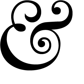
the ampersand

This is a blog completely on ampersands. I have to credit, leeanne found this first, but i though it belonged on the type blog

from leeanne "i guess there's a blog out there for everyone... this one is solely about ampersands! but i agree, the ampersand is definitely one of the nicest symbols in typography."

... and here's a little fun fact - the shape of the ampersand was derived from the latin word "et"... who knew?


29 July 2008

Typophile, etc

I found a cool site I'd never seen before: typophile.com

Came across a thread about slab serifs, and one of the people who was part of the discussion is Nick Shinn, founder of Shinn Type (Shinntype.com). he designed Bodoni Egyptian, an elegant slab serif that reminds me of Archer in its delicacy. To view the PDF, go here: http://shinntype.com/Bodoni_Egyptian.pdf


Also love this t shirt that represents stroke weights...light, regular, bold, bold italic.

25 July 2008

Color Euphoria

I LOVE these dreamy, colorful, saturated typographic experimental pieces by Alberto Seveso.
See more here